Nova barra de vida: aqui as mudanças!
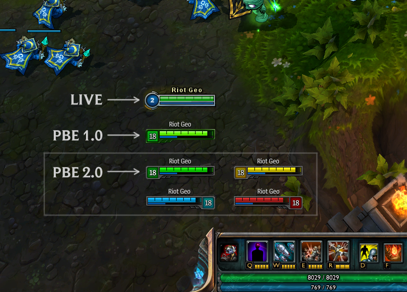
No servidor PBE vieram os novos gráficos para a barra de vida posicionado sobre a cabeça do nosso campeão: o objetivo é ajudar os jogadores durante o jogo para mais facilmente identificar o seu campeão e você sempre tem a informação relacionada com HP restante.
A primeira coisa que você nota é o uso de três cores diferentes: um para os adversários, um para seus aliados e um para o seu personagem.
O que você acha?
Thanks for the huge response to our last thread. We are back with another round of iteration.
Recap of our Goals:
• Enable instantaneous identification of self, ally, and enemy
• Elevate vital information
• Move towards unified player views for colorblind and non-colorblindWhat’s New?
In trying to meet the above goals, we’ve had to balance functionality and style. We think this iteration strikes that balance well – firmly grounded in the LoL universe by drawing cues from the surrounding HUD and hitting our clarity goals.
Look for the update soon on the PBE and leave us more feedback below.Story time:
• If you’ve ever been on the receiving end of a Rocket Grab you probably know that moment of panic where you try to figure out, “Where am I?”
• In a team fight you may have had a split second of confusion – unable to differentiate between friend or foe in the scrum.
• When you’re dueling the enemy Ashe and your eyes are locked onto her Health Bar, you need to know how close you are to death with only a glance so you can pop Barrier at the right moment.
• Maybe you’ve watched a stream or LCS match and then jump into your own game where things look a little different.
When we approached this Health Bar rework these are the issues we were looking to tackle and improve. They boil down to: identification, info priority, and unified views.